Your homepage is not a digital brochure—it’s a cognitive shortcut that either builds trust in 3 seconds or triggers the back button. Research from Nielsen Norman Group’s homepage usability studies reveals that users spend an average of 8-10 seconds on a homepage before deciding to stay or leave, and 57% of that time is spent scanning the header and above-the-fold area. Yet businesses bury critical information below animated sliders and mission statements.
The cognitive load is brutal. A first-time visitor must answer five questions in 8 seconds: What is this? Is it for me? Can I trust it? What do I do next? How do I contact them? Every element that doesn’t answer one of these questions is cognitive friction that increases bounce rate. And bounce rate is expensive—a 1-second delay in page load reduces conversions by 7%, and cluttered homepages increase load time by an average of 2.3 seconds.
This guide maps the mandatory homepage information architecture for different business models, the psychology of trust signals, and the mobile-first imperatives that convert browsers into buyers.
The 8-Second Rule: What Must Be Above the Fold
Above-the-fold is prime real estate because it’s the only part of your homepage that 100% of visitors see. The fold line varies by device (mobile is much smaller), so your above-the-fold content must work on a 5-inch phone screen.
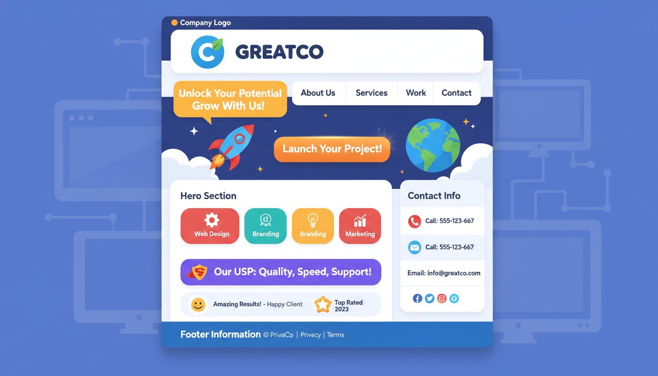
The Non-Negotiable Header Stack
Your header must answer the “How do I reach you?” question instantly. The header is visible on every page, so it’s your persistent trust signal.
📞 Phone Number: Click-to-call on mobile, formatted with area code
📧 Email: mailto: link, ideally info@yourdomain (not Gmail)
📍 Address: Only if physical location is relevant; link to Google Maps
⏰ Hours: If you have set business hours; dynamic “Open Now/Closed” status
🔍 Search Bar: For content-heavy sites; magnifying glass icon on mobile
The Hero Section: One Headline, One Button, Zero Distractions
Your hero section must answer “What is this?” and “What do I do next?” in one glance. The headline should be a simple subject-verb-object sentence that a 5th grader can understand.
Bad: “Empowering Your Digital Transformation Journey” (means nothing)
Good: “We Fix Leaky Faucets in Austin—Same Day” (clear, specific, benefit)
Great: “Your AC Fixed in 3 Hours or You Don’t Pay” (risk reversal + guarantee)
The CTA (Call to Action) button must be a contrasting color and contain an action verb. “Get Quote,” “Book Now,” “Call Today”—not “Learn More” (too vague) or “Submit” (too corporate).
The Trust Equation: What Builds Credibility in 3 Seconds
Trust isn’t built by saying “We’re trustworthy”—it’s built by showing third-party validation. The human brain processes social proof 2.3x faster than marketing copy because it’s processed as fact, not persuasion.
Mandatory Trust Signals (Above the Fold)
These elements must be visible without scrolling:
⭐ Review Score
4.8/5 stars from 200+ reviews (Google, Yelp, Trustpilot)
Placement: Top right corner, never hidden in footer
🏆 Credentials
BBB A+, Licensed & Insured, Industry Certifications
Placement: Header bar, small but visible logos
💬 Social Proof
“Saved me $300!” – Sarah M., photo + first name
Placement: Hero section, rotating testimonial
⚡ Guarantees
“Fixed in 3 Hours or Money Back”
Placement: Directly under headline, bold text
Industry-Specific Homepage Architecture: One Size Does Not Fit
A SaaS homepage has different goals than a restaurant homepage. An e-commerce site needs different trust signals than a law firm. The information hierarchy must match the customer journey.
Service Businesses (Plumbers, Consultants, Agencies)
Primary Goal: Generate a phone call or appointment booking
📞 Phone Number: Click-to-call, in header and hero
📅 Booking Widget: Real-time availability, integrates with calendar
📍 Service Area Map: “We serve these zip codes” with visual
💰 Price Range: “Projects start at $500” (qualifies leads)
🏅 Technician Photos: Real humans, not stock photos, build trust
E-commerce (Shopify, WooCommerce)
Primary Goal: Reduce purchase friction
🚚 Free Shipping Bar: “Free shipping over $50″—reduces cart abandonment
🔒 Security Badges: SSL, payment icons (Visa, MC, PayPal)
📦 Return Policy: “30-day returns, no questions asked”—reduces risk
⭐ Recent Reviews: “Jessica from Texas bought this 2 hours ago”
💸 Price Match: “Found it cheaper? We’ll match it”
SaaS/Tech Products
Primary Goal: Demo signup or free trial
🎮 Live Demo: “Try it now—no credit card needed”
📊 Data Numbers: “10,000+ teams use us,” “99.9% uptime”
🔧 Integration Logos: “Works with Slack, Salesforce, G Suite”
👨💼 Customer Logos: “Trusted by Microsoft, Stripe, Shopify”
📚 Documentation Link: “Read the API docs”—builds developer trust
Restaurants/Physical Retail
Primary Goal: Get them through the door
📍 Address + Directions: Embedded Google Map, “Get Directions” button
🕒 Hours (Dynamic): “Open until 10 PM tonight,” “Closes in 2 hours”
🍽️ Menu/Pricing: PDF or HTML menu—don’t make them hunt
📸 Interior Photos: Shows atmosphere, builds expectation
📅 Reservation Widget: OpenTable integration or phone reservation
The Mobile-First Imperative: Thumb-Friendly Homepage Design
Mobile traffic accounts for 58% of all website visits, but mobile conversion rates are 2x lower than desktop. The culprit: information buried below the thumb zone. A mobile homepage must be designed for one-handed use with the thumb reaching the top half of the screen.
The Thumb-Zone Rule
🚫 No Hover Effects:
Mobile doesn’t have hover. Buttons must be clearly clickable.
📏 Button Size:
Minimum 44×44 pixels (Apple’s guideline)
👆 CTA Placement:
Bottom 30% of screen—thumb’s natural rest
📱 Phone Link:
Must be clickable tel: link, not static text
The Mobile Fold Is Tiny: Prioritize Ruthlessly
On an iPhone 14, the fold is approximately 400 pixels high. That shows your logo, headline, one button, and maybe one image. Everything else is buried. Your hierarchy must be:
1. Logo + Phone Button: Header (80px)
2. Headline + CTA: Hero (200px)
3. Trust Badge: Review stars (60px)
4. Everything Else: Below the fold (requires scroll)
If your mobile homepage doesn’t convert, it’s because you’re asking users to scroll before they understand what you do. That’s like asking someone to read page 2 of a contract before telling them what you’re selling.
The Psychology of Scrolling: What Belongs Below the Fold
Below-the-fold content is for people who’ve decided to stay. It’s where you provide depth, answer objections, and tell your story. But it must be earned with above-the-fold clarity.
The Minimum Viable Homepage (MVP) Structure
Section 1: The Problem (2 sentences + image)
Section 2: The Solution (How you solve it, 3 bullet points)
Section 3: The Proof (3 testimonials with photos)
Section 4: The FAQ (3 objections answered)
Section 5: Final CTA (Same as hero, repeated)
What NOT to Include Below the Fold
These elements destroy conversion by creating decision paralysis:
🚫 Stock Photos: Generic handshake photos signal “we’re fake”
🚫 Mission Statements: “We believe in excellence”—so does everyone
🚫 Press Releases: “We’re excited to announce…”—no one cares
🚫 Awards from 2017: If it’s not recent, it’s stale
🚫 Multiple CTAs: “Call us, email us, visit us, follow us”—paralysis
The Homepage Audit: Your 5-Minute Conversion Checklist
Before you launch, run this audit. If you answer “No” to any question, fix it before the page goes live.
The Brutal Homepage Audit
| Question | Yes | No | Fix |
|---|---|---|---|
| Can I understand what you do in 8 seconds? | ✓ | ✗ | Rewrite headline |
| Is your phone number clickable on mobile? | ✓ | ✗ | Add tel: link |
| Do you show trust signals above the fold? | ✓ | ✗ | Add reviews/badges |
| Is there only ONE primary CTA? | ✓ | ✗ | Remove extra buttons |
| Does it load in under 3 seconds? | ✓ | ✗ | Compress images |
Your Homepage Is a Test, Not a Trophy
The most beautiful homepage is the one that converts. The most informative homepage is the one that answers questions before they’re asked. The most expensive homepage is worthless if the phone number is buried in the footer.
Stop treating your homepage like a design showcase. Start treating it like a 24/7 salesperson who has 8 seconds to make a first impression. Give them the information they need to trust you, the reason to stay, and the button to click.
Launch the ugly, clear homepage today. Iterate the beautiful, confusing one never.